
READTYCH
Revamping an E‑ink Custom OS
Role
UX/UI Designer
Company/Client
READTYCH Corp
Timeline
Q1–Q4 2024
My vibe
Practical, calm, detail‑first
Practical, calm, detailed
Project Overview
READTYCH was building an education‑first E‑ink tablet. The old direction had a 3‑screen layout, big visual inconsistencies, and shadows that didn’t play well with E‑ink. I came in to simplify, align, and speed things up.
My focus:
- Make navigation obvious, not clever.
- Keep visuals honest to E‑ink (contrast, spacing, weight).
- Create a system so designers/devs stop reinventing screens.
In short: Two clean screens, repeatable patterns, less friction for students, happier devs.
The Problem
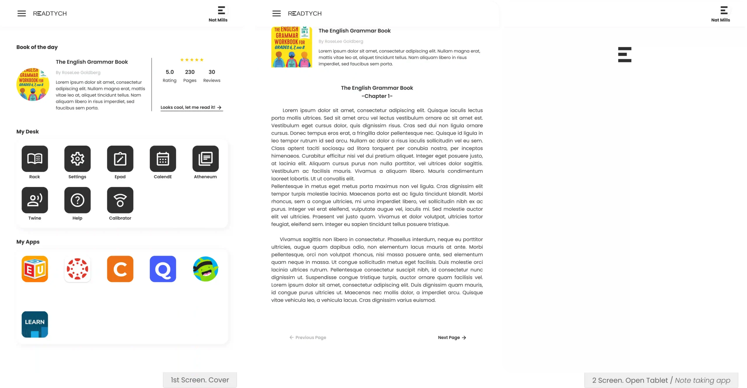
- Over‑complex layout: 3 screens created more confusion than clarity.
- Visual noise: oversized components, incompatible drop‑shadows, uneven spacing.
- Slow velocity: each new feature felt like starting from scratch.
Why it mattered:
Students and teachers need calm, legible interfaces. E‑ink is unforgiving: low refresh rates, ghosting, and low color depth punish fancy UI tricks. The product needed discipline.
Old Design. 3 screen tablet
Users & Context
Audience:
Middle‑ and high‑school students + teachers using the device daily for lessons, notes, assignments, and quick reference.
Top pain points:
Hard to find the right app/state quickly.
Mismatch between UI effects and E‑ink behavior.
Inconsistent patterns across screens.
Constraints:
E‑ink limitations (contrast, refresh).
Tight delivery windows for pilots.
Small design/dev team; we needed leverage.
Goals & Success Criteria
- Clarity: reduce wayfinding confusion.
- Consistency: one system, many apps.
- Speed: cut design & iteration time per feature/app.
- Feasibility: everything should map cleanly to E‑ink.
KPIs
- Design efficiency (+≈70%).
- Hours per feature (down to ~4–16h).
- Hours per app (down to ~48h).
- Time to a robust MVP (down to 8 months for 11 apps).
Research & Principles
I looked at prior iterations and engineering feedback; a constraint review of E-ink (type scales, stroke weights, refresh/motion, and alternatives to shadows); and a scan of competitive patterns for note-taking and study workflows.
Design principles I set
- Legibility first: high‑contrast text, predictable spacing, minimal effects.
- One mental model: identical patterns for navigation, search, actions.
- Accessible by default: hit targets, line height, empty‑state clarity.
- System over pages: components > bespoke screens.
Design Process
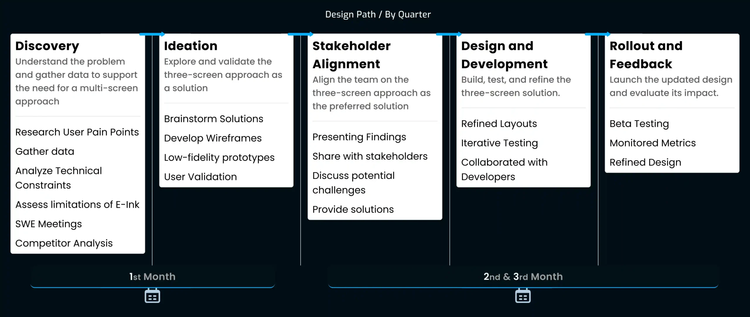
Turning research into something usable meant sketching, testing, and refining—fast. I began with quick wireframes to explore how the two-screen model might work in practice. From there, I built low-fidelity prototypes to see how students would move between reading and note-taking without friction.
Along the way, I kept things lightweight: sketches on paper, early FigJam flows, and clickable mockups that let the team try ideas before we locked them in. Each round gave us feedback to trim complexity and keep the layout calm and focused.
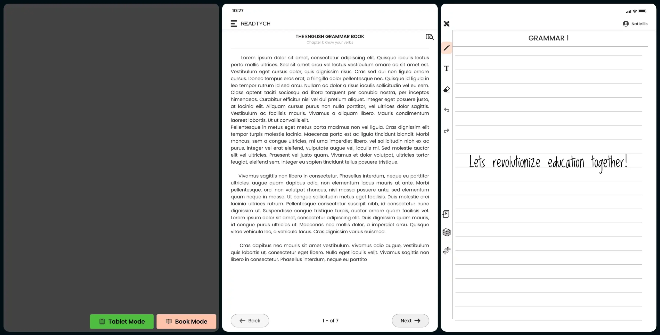
Hall App. White paper to simulate the open and closed tablet, with the 3rd screen view when its "closed"
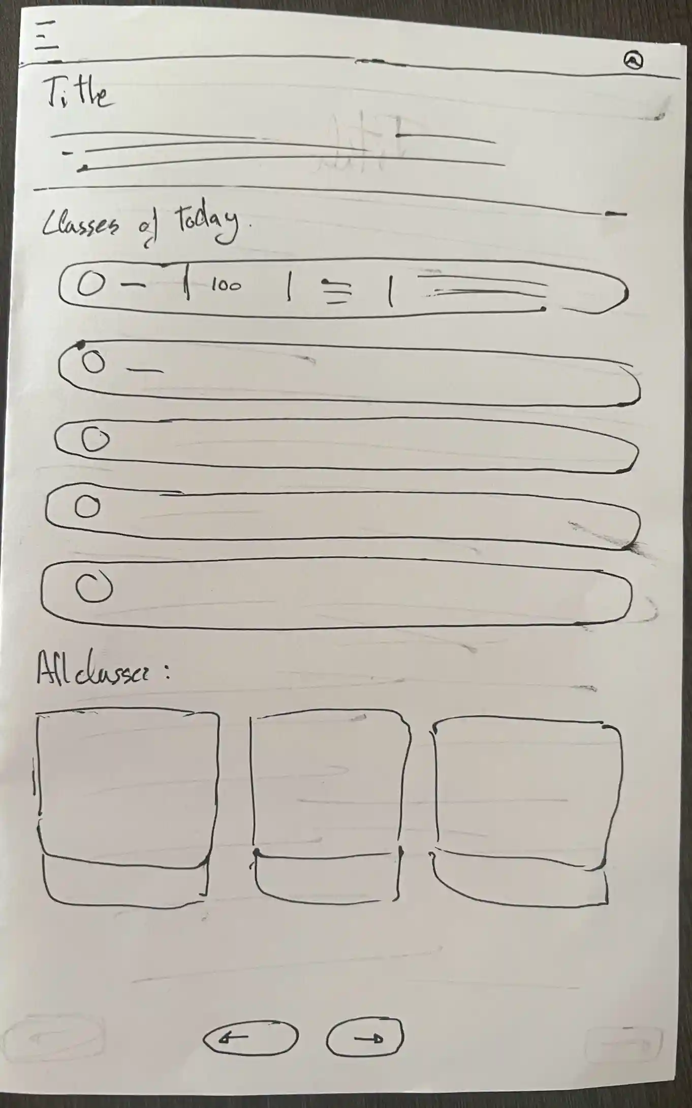
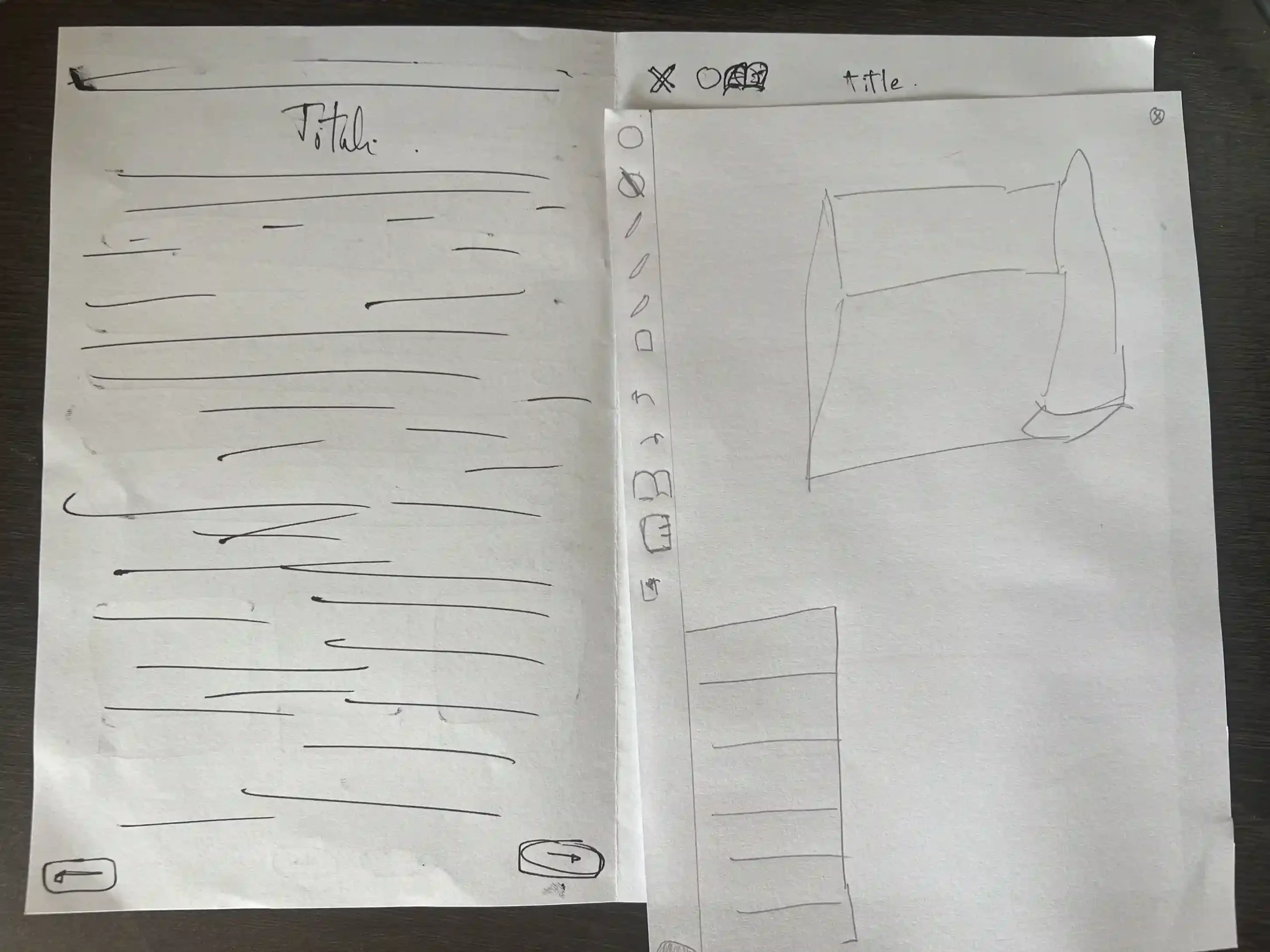
This process wasn’t about perfect screens; it was about learning quickly, aligning with the team, and building confidence that our direction matched real classroom needs.
3 screens Epad App View
Information Architecture
Sitemap MVP
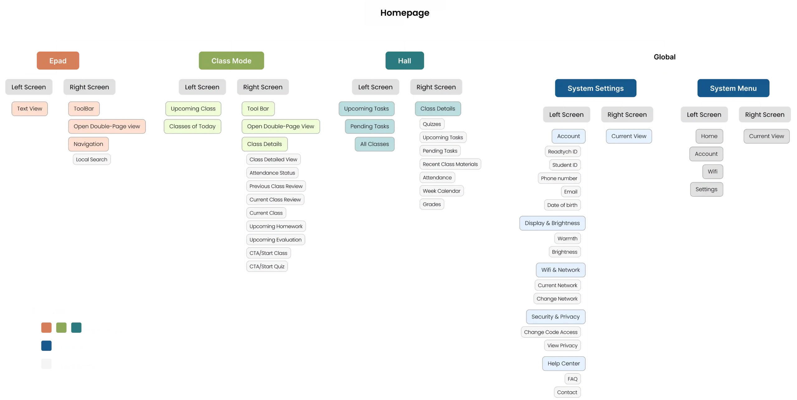
MVP IA for the pilot: Epad, Class Mode, Hall. Global shell (System Settings, System Menu) shown for context. Non-MVP modules are intentionally omitted to honor scope/NDA.
User Flow: Start Class → Read & Take Notes (MVP)
System & Components
Built for repeatability:
Optimized canvas for E‑ink resolutions.
Type scale that survives ghosting.
Icon grid with uniform stroke weights.
Color tokens for E‑ink states (ink, light, accent).
Spacing/margins rules.
Reusable app frames and content blocks.
Old Rack App vs. Latest Rack App
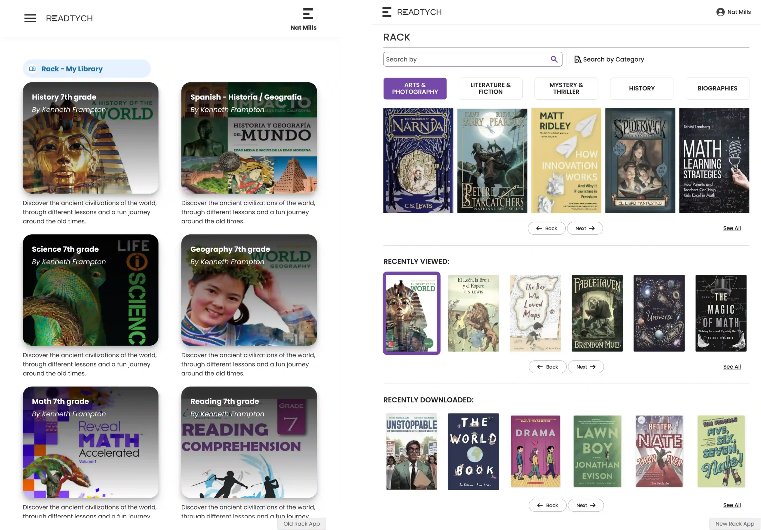
Iterations → Decisions
3 screens → 2 screens
Dropped the third surface to reduce cognitive load and dev complexity. Clear split: Left = reference, Right = work.
Navigation unification
Fixed top bar + predictable app switcher. Removed novel patterns that fought E‑ink.
Shadows → Structure
Replaced drop‑shadows with elevation via spacing, rules, and contrast.
Dev‑friendly controls
Added quick toggles to preview Tablet Mode (single screen) vs Book Mode (dual) during builds/tests.
Visual Design
Neutral palette tuned for E‑ink; accent used sparingly for focus.
Generous white space and stable elements (no jittery refreshes).
Empty states that teach the UI.
Epad. Preview of Note
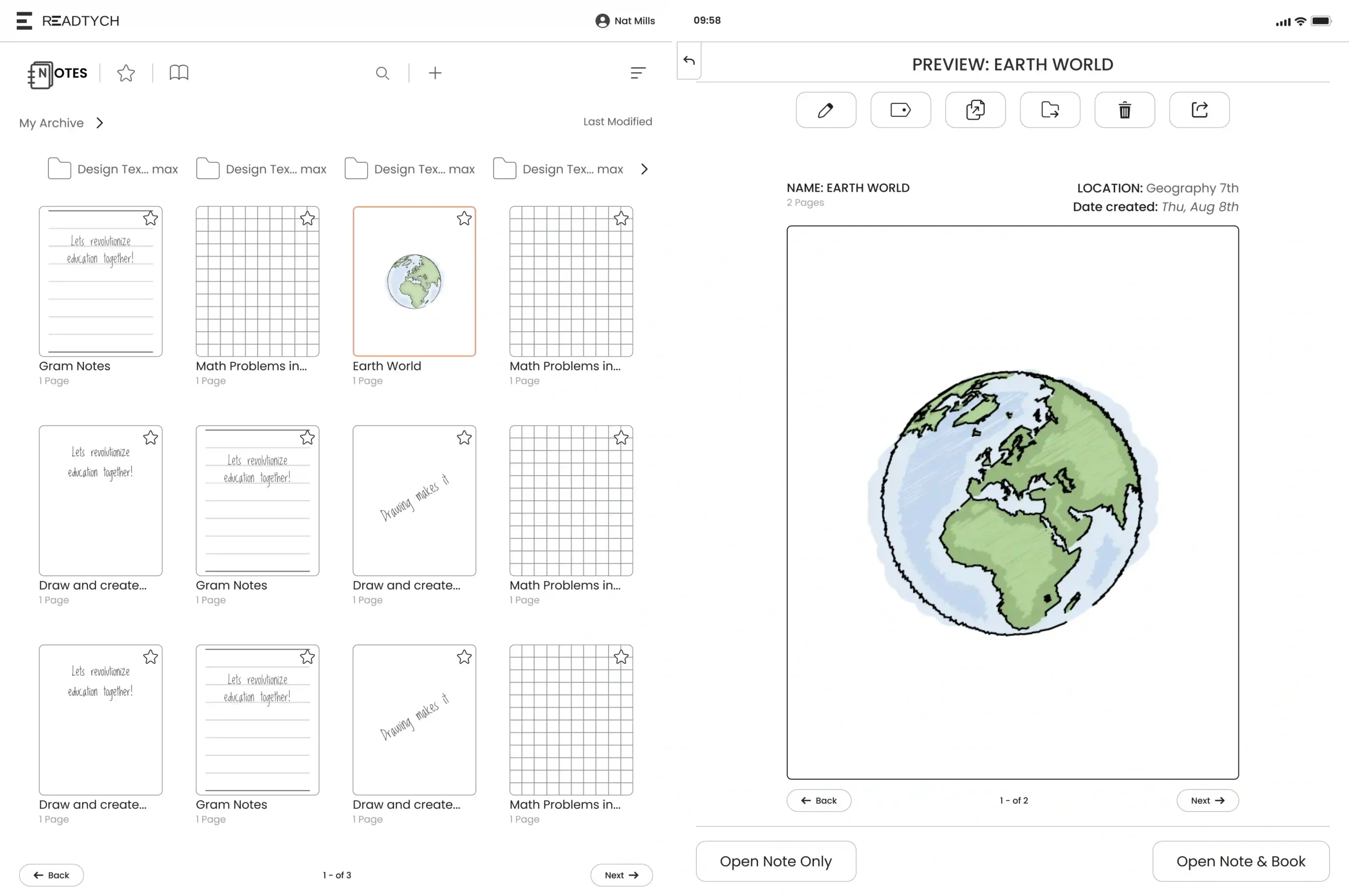
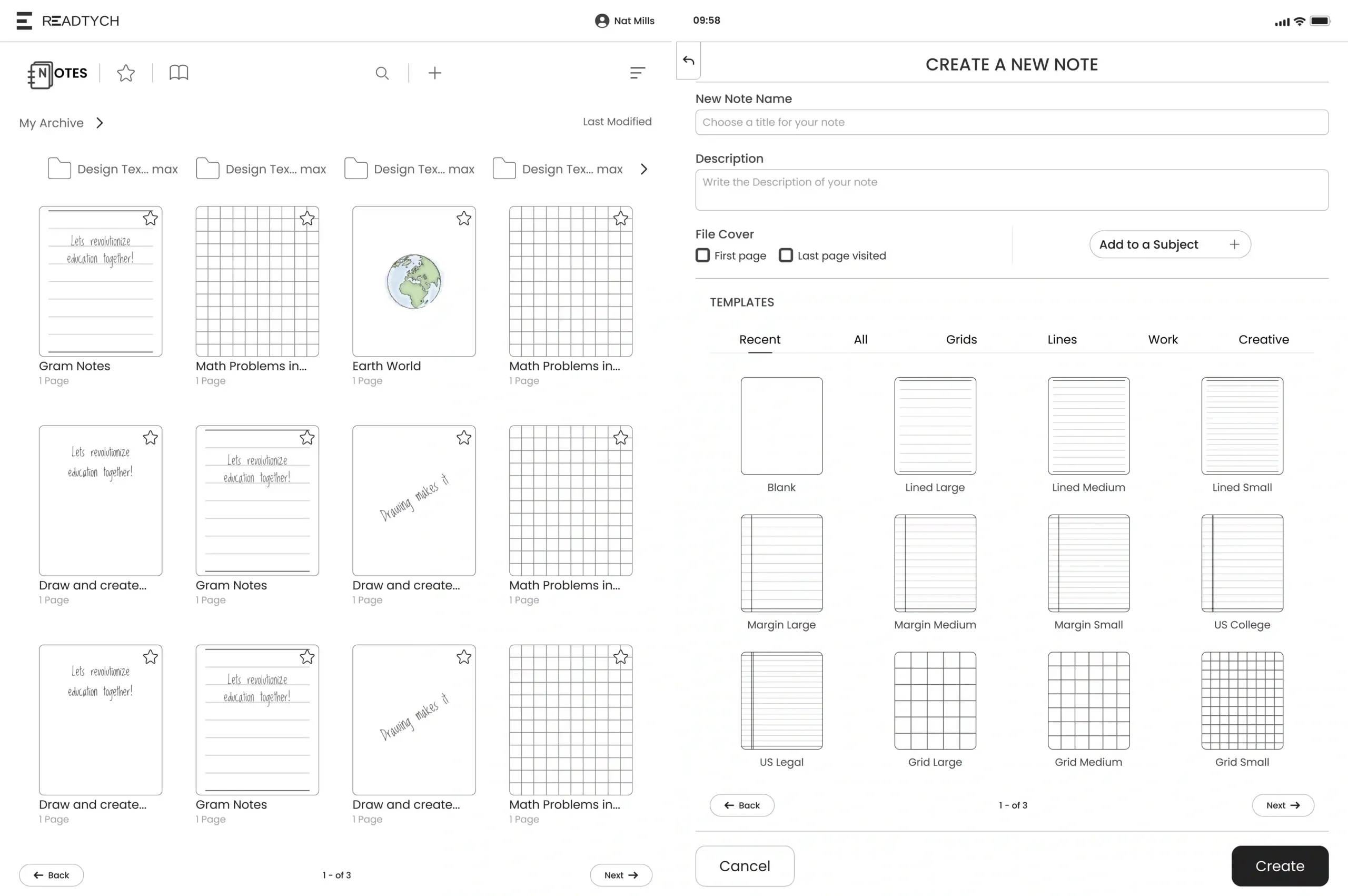
Epad. Note Creation
Epad. Note options & more
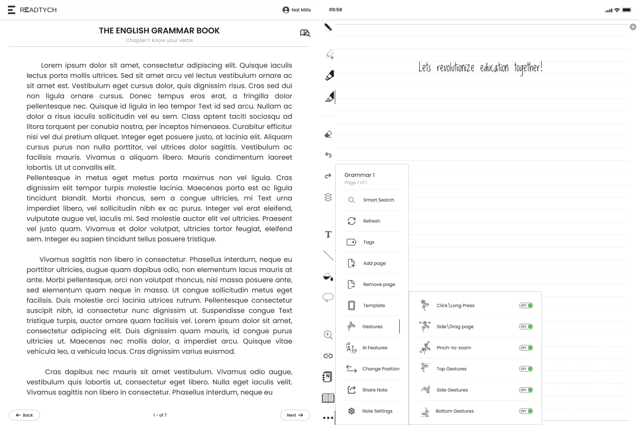
The editor scales with 20+ writing & study tools (organization, input, layout, utilities) designed for E-ink performance
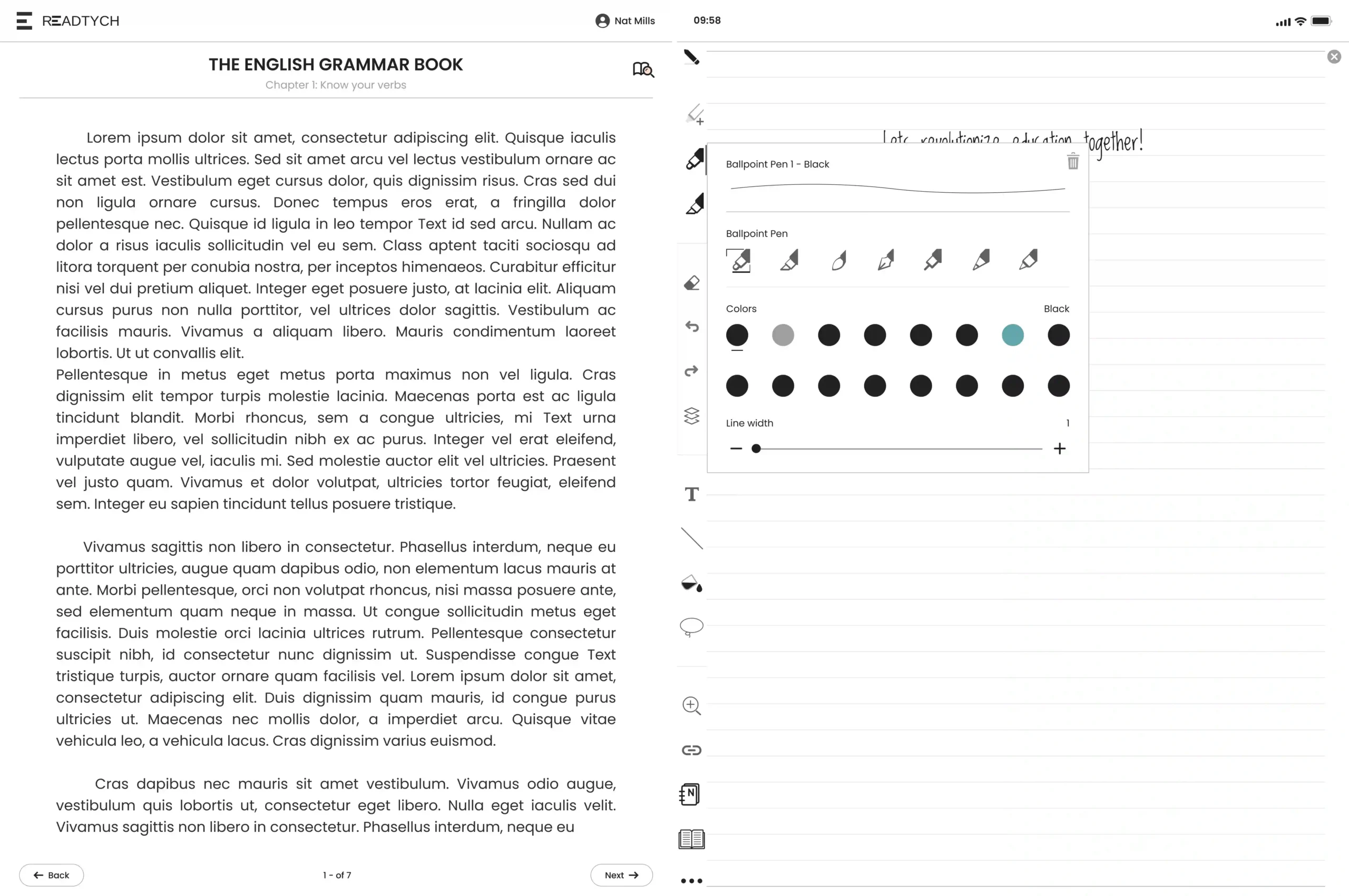
Epad. Note brushes
Results & Impact
Speed
- Design efficiency up ~70%.
- Per‑feature time down to ~4–16h; per‑app ~48h.
Throughput
- 11 lightweight education apps delivered in ~8 months (vs. 3 in ~13 months prior).
Business
- Clearer roadmap + stronger investor story; contributed to a double‑digit million lift in valuation within a year.
Team
- Designers and devs speaking the same system language; less rework.
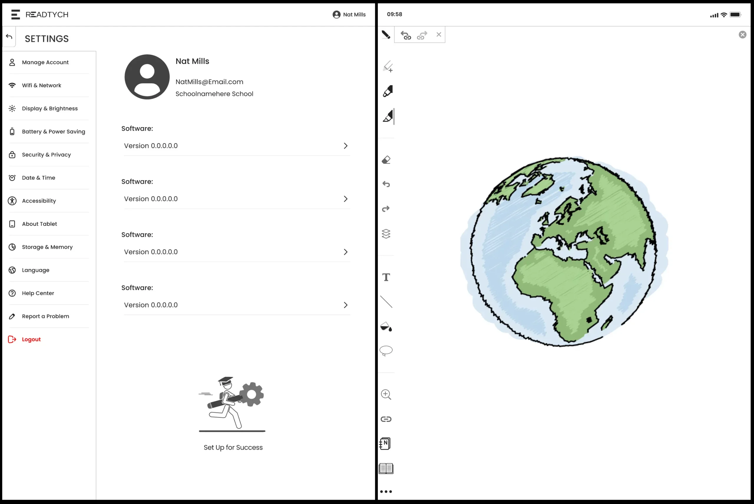
Settings opened inside a note in Epad App.
Conclusion
We built a calm, classroom-ready workspace that feels simple and stays out of the way. By cutting the clutter and moving to a clear two-screen setup, everything became easier to find and faster to use. The team moved quicker too, about 70% faster, delivering 11 light apps in ~8 months. The big takeaway: when the basics are clear and consistent, even a complex product feels friendly and scalable for what’s next.